G L I S T E N C O S M E T I C S

GLISTEN COSMETICS
Glisten Cosmetics is an e-commerce website marketing bold, unique makeup products to consumers and influencers.
My Role
UI/UX Designer
Tools Used
Figma, Optimal Workshop, Photoshop, Miro
Scope
2.5 weeks
What I Did
User Research, Information Architecture, Usability Study, Prototyping
Glisten Cosmetics Website:
Why redesign?
The Background
Glisten Cosmetics is an indie makeup brand based in the UK. They are known for their unique products and bold marketing. The brand currently has an online platform for browsing and purchasing their products, though it contains some glaring issues.
The inconsistencies in the site's navigation and layout leave users feeling frustrated and confused. Although users are intrigued by the products offered, they are too put-off by the inconveniences presented by the existing interface.
Redesigning the website will help users navigate the site more seamlessly and provide a greater overall shopping experience.
The Industry
The future of the beauty industry is bright. As of 2022, the beauty industry generates over $100 billion in revenue worldwide, with cosmetic retailers reporting $17.09 billion in online sales.
With the industry on the rise and online retail providing a substantial stream of revenue, it is vital for cosmetic retailers to provide their users with the optimal digital experience.
The Challenge
In order to deliver a redesigned product that eases their frustrations, I set out to understand the current pain points of users going through Glisten Cosmetics' website.
My goal was to modify the interface so that users felt comfortable and reassured this brand would provide them with an optimal shopping experience.


The Problem:
Issues with the website
The first step in the design process was to do a heuristic evaluation of Glisten Cosmetics' current website.
These were the main usability issues:
• Efficiency: product viewing on the site lacks a "Shop All" function to show all available products
• Match Between System & Real World: "Join Our Community" for the brand's newsletter is not intuitive for users
• Aesthetic & Minimalist Design: the "Klarna Plan" page's content is all in italics, making it difficult for users to easily scan for pertinent information
• Consistency & Standards: the fonts and formatting across the internal links in the footer are inconsistent
User Needs:
Testing the current structure
Next, it was time to conduct a usability test on the existing site. My testing goals were:
• Measure the usability of browsing & search functions
• Gauge the consistency with navigation
• Identify pain points for the user
With these goals in mind, I performed this test with 4 participants. The key findings from these test were as follows:
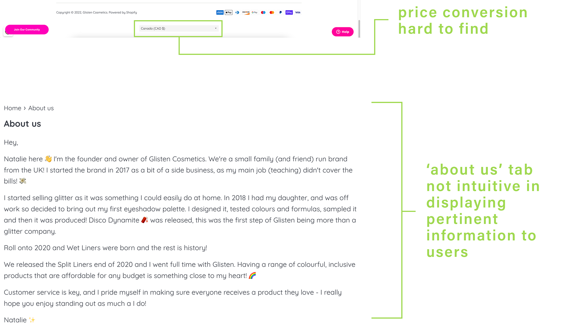
• 75% of users struggled to convert currency with the price converter poorly placed at the bottom of the site footer
• 0% of the users associated "Join Our Community" with partnership opportunities for influencers
• 100% of users expected the "About Us" page to contain information relevant to the company's mission & core values
• 50% of users found the inconsistency with the payment plan options to be confusing
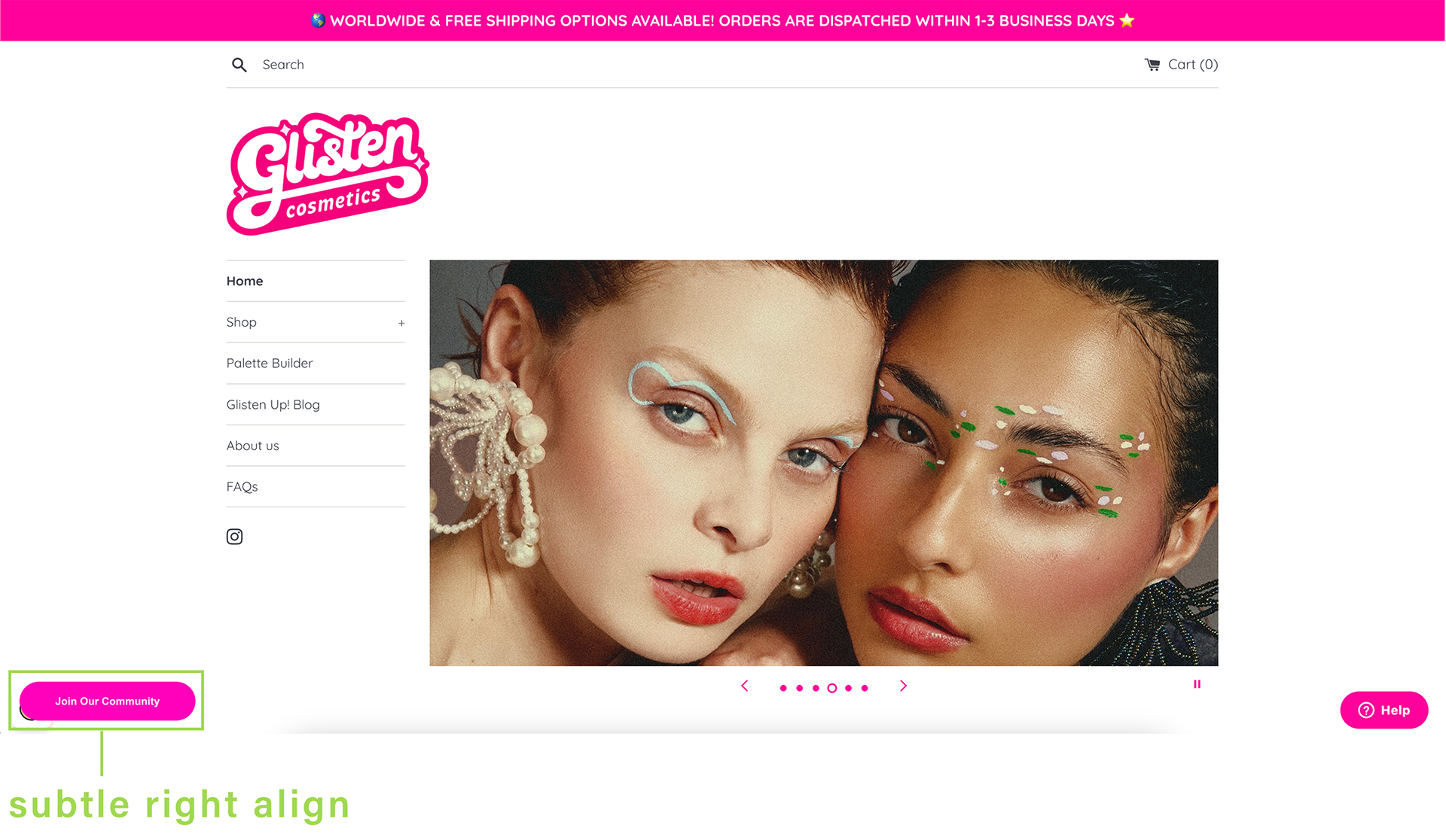
Additionally, the subtle right align of the site's content due to the sticky "Join Our Community" CTA proved to be an aesthetic choice that users did not favor.
Usability Test:
How did users feel?
"'Join Our Community' does not sound fun. You never want to join a mail list."
"I feel like a lot of it is just hidden by poor user interfacing, really. Like, this is ridiculous."
"Their makeup is so bright and fun but then the website just seems to fall flat."

The Problem Statement
Using the information gathered through the Discover phase, I was able to clearly define the problem:
People who wear makeup need a better way to navigate Glisten Cosmetics' website because the current interface causes frustration and confusion.
Empathizing With Users
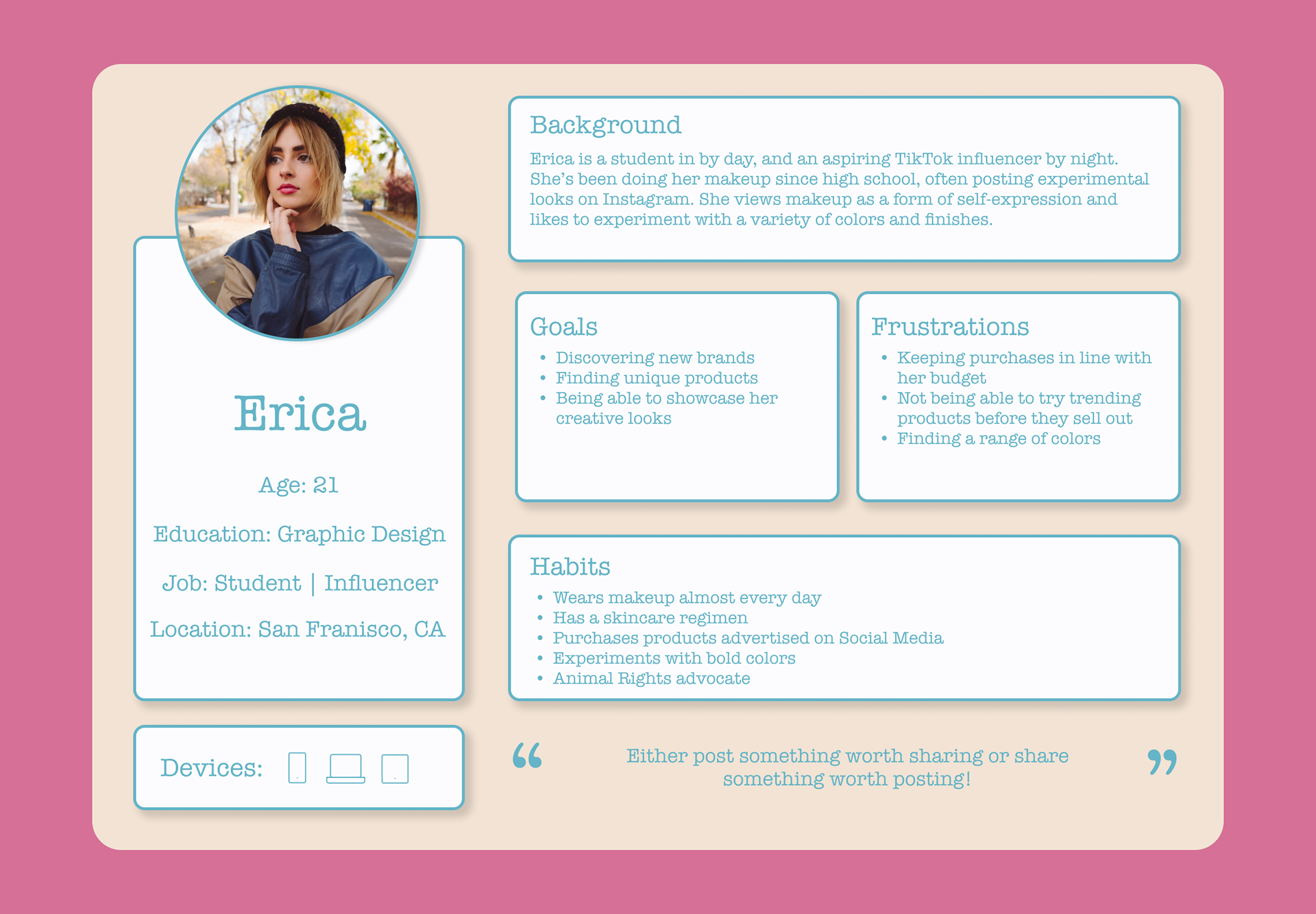
Then, with the business research data and the usability test results, I created 2 proto-personas to keep the brand's target audience in mind throughout the design process.

Restructuring the Content:
Open Card-Sort & Sitemap
Before jumping into redesigning individual pages of the website, I made a list of all the content there is. Their current website had clear categories but the content was inconsistent.
To better understand how to group and rearrange the content of the website, I started out with an open card-sort.
I remotely tested 4 participants using OptimalWorkshop, and discovered some key insights:
• 100% of users paired "Our Mission" with Glisten's "Newsletter Sign-Up," supporting the assumption that "Our Mission" belongs in the "About" category.
• Rather than separating products into categories by type, 75% of users paired all products together, supporting the assumption that a "Shop All" page would be useful.
• A majority of users paired the "Glisten Up!" blog with the brand's Instagram and general "Follow Us" CTA, categorizing the blog as part of their social media.
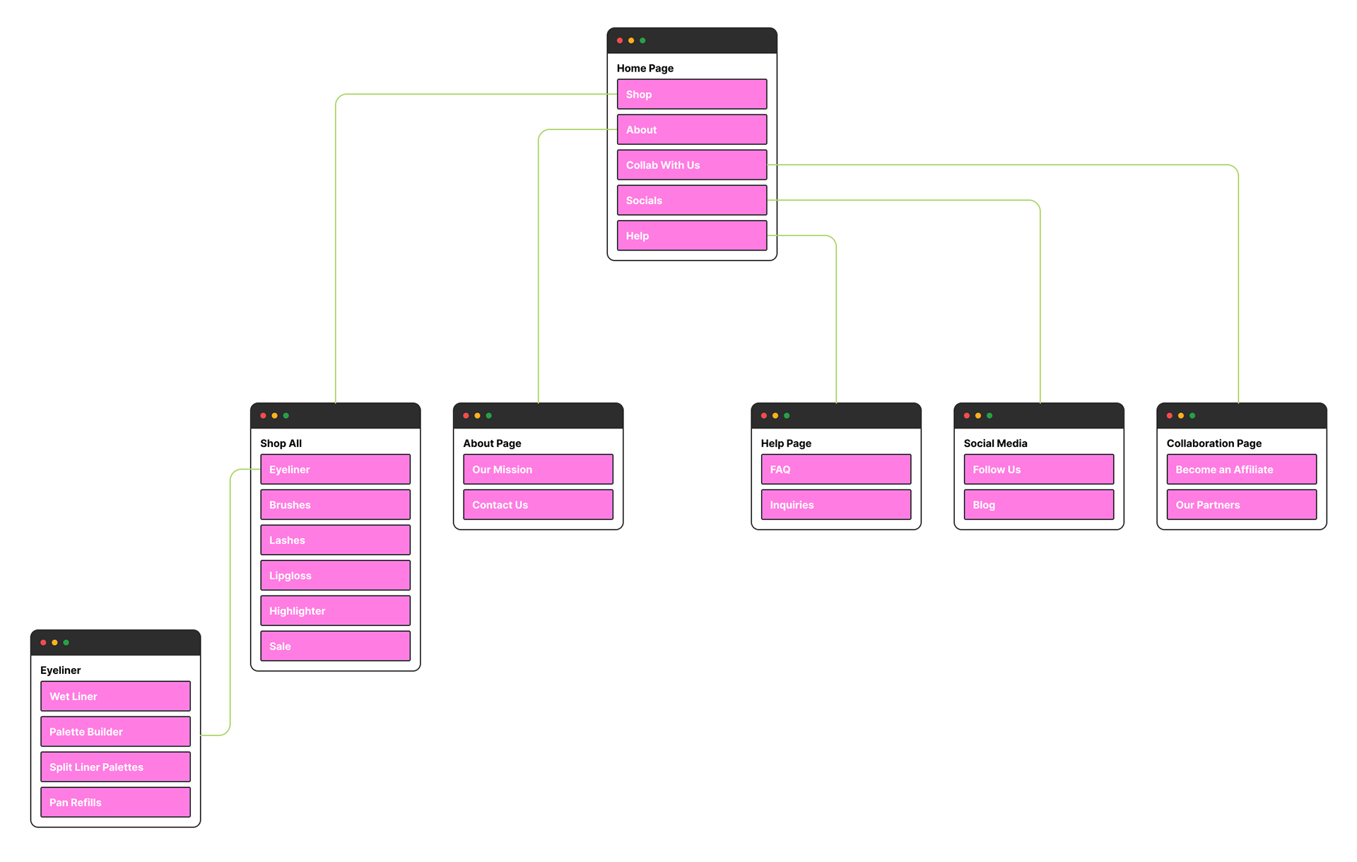
Using these findings, I was able to create a sitemap for my redesign.
Validating Assumptions:
Closed Card-Sort
After creating the sitemap for the initial redesign of the website's navigation, I set out to test these assumptions with a closed card-sort.
I was able to remotely test 3 users with the layout from the sitemap, and validate my assumptions:
• All of the products were sorted into one overarching "Shop" category
• 100% of users placed "Our Mission" in the "About" tab
• "Become an Affiliate" is more intuitive for influencers than "Join Our Community"

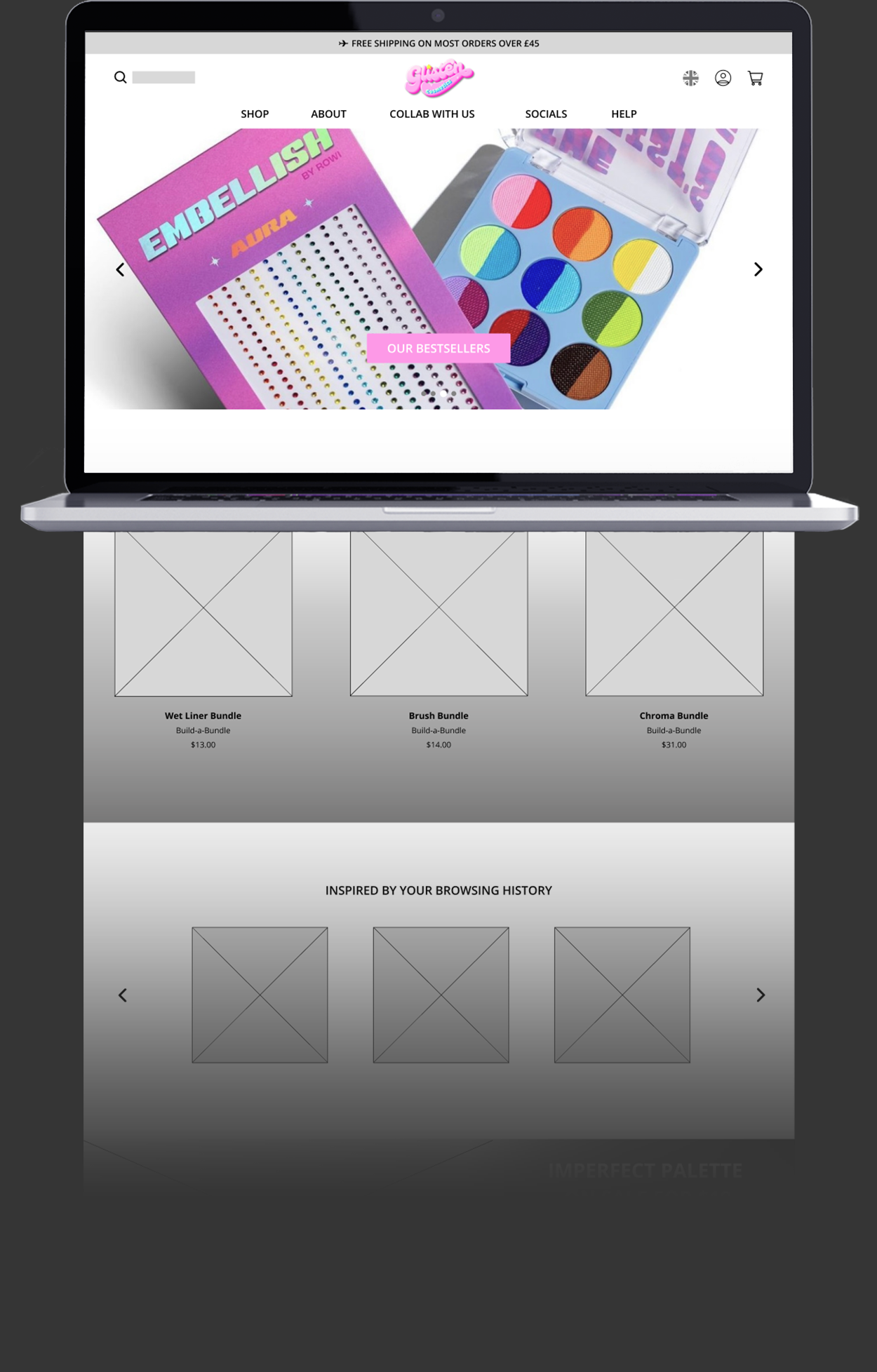
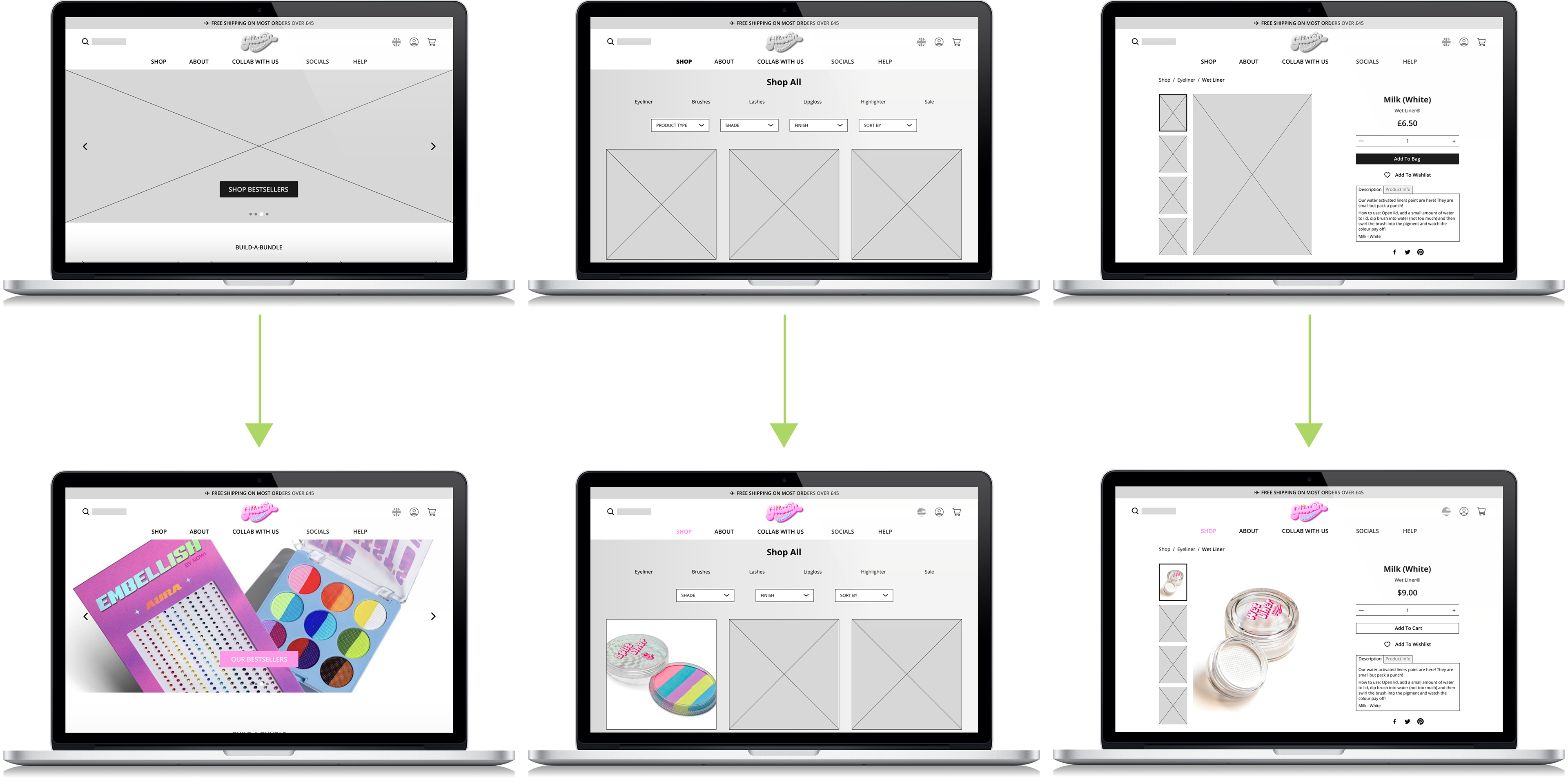
Wireframing:
Low-Fidelity to Mid-Fidelity
Developing the redesign began with low-fidelity prototyping.
Taking inspiration from websites I researched through competitive analysis and combining it with the data gathered from my user research, I was able to redesign the layout.
Following the initial low-fidelity prototype, I iterated the design to a mid-fidelity clickable prototype in Figma.
This prototype provided solutions for:
• The inconsistent navigation: each tab was organized to be more intuitive based on the results of user testing
• The misuse of negative space: rearranging the site's content using practices implemented by leading cosmetic retailers, the website is more engaging
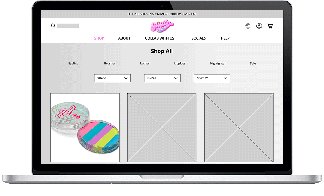
• The inefficient organization: providing the users with a "Shop All" category allows for them to scan available products more easily, while also having the opportunity to filter based on their preferences

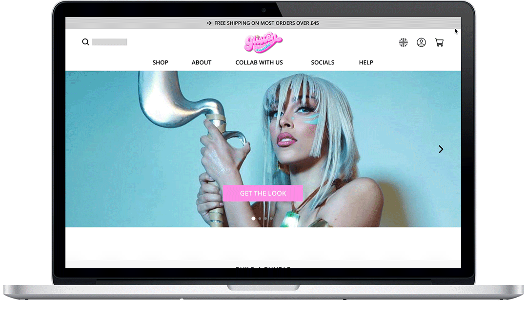
Welcome to Glisten Cosmetics
The one-stop shop for your boldest makeup looks.
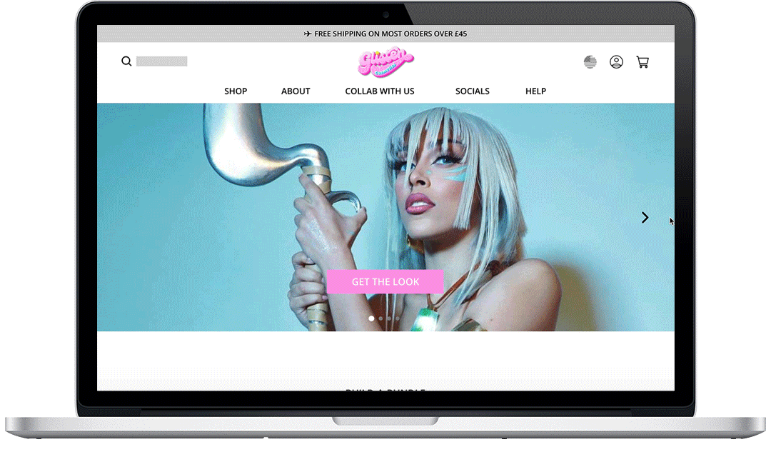
Not From The UK?
Convert Currency With A Few Clicks.
Get Inspired!
Browse Featured Products With Ease.
Window Shop While You Wait —
Or Filter By Your Faves.
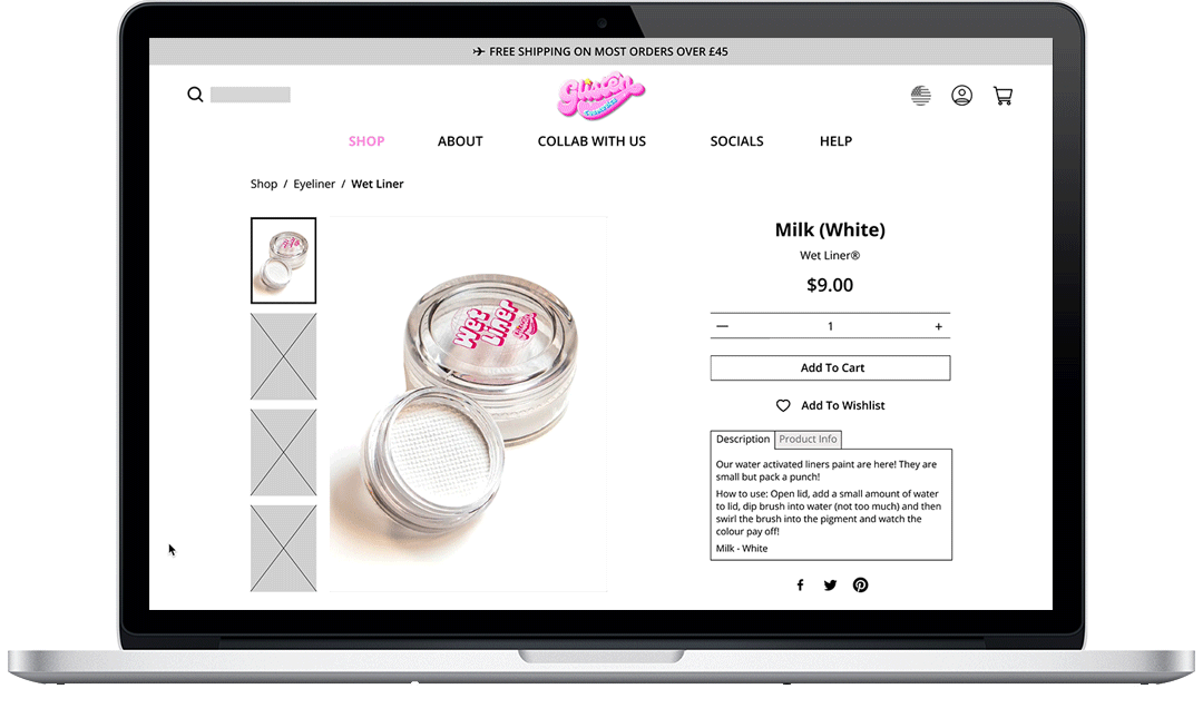
Wanna Know How It's Made?
Learn More With A Simple Scroll.
Add It To Your Cart —
Or Save It For Later.
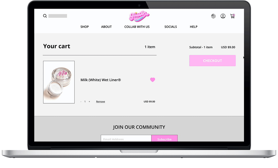
Guaranteed Satisfaction!
Secure Check Out Every Time.

Moving Forward:
Next Steps
Further iterations of Glisten Cosmetics' redesign would concentrate on:
• Performing usability tests on the current iteration in order to validate assumptions and gauge any remaining pain points users might face
• Using the results and data gathered from usability studies to create a high-fidelity clickable prototype for the redesign
• Creating a component library and getting in touch with the client to plan for a potential developer hand-off
Retrospective:
What I've learned
One of the biggest challenges with this redesign was figuring out how to navigate the problem space. With a limited time frame, I initially struggled to find appropriate participants for my user research.
I wanted to hone in on the pain points of users who wear makeup regularly/semi-regularly, but this proved difficult with my projected timeline.
Eventually, 75% of my interview participants matched the potential target audience of Glisten Cosmetics, and I was able to use this information to create proto-personas.
If I had more time and access to a larger pool of participants, I would have tried to conduct studies with a more diverse age range to gauge the differences in perspective.
The limited time frame also made it difficult to perform any type of usability test on my mid-fidelity prototype, thus I lacked the data needed to further iterate and refine the redesign.
Missing this vital piece of information made me reflect and re-evaluate the efficiency of my project timeline, and learn how to prioritize my tasks and deliverables more effectively for future sprints.